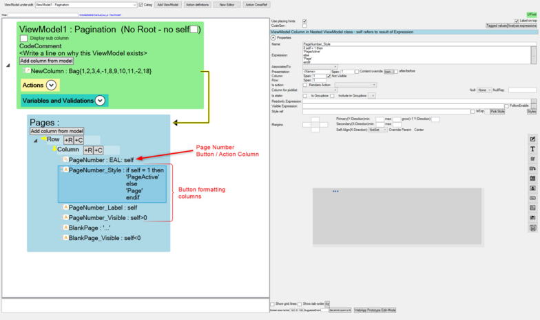
Buttons are used for executing expressions both in UI ViewModels and ServerSide ViewModels. Having the ability to change how they look and where they are positioned is important for an aesthetic UI.
The MDriven Designer ViewModel has a styles property to set different types of formatting for the UI Widgets.
MDriven also provides special keywords for more control and customization of the UI elements. They can be used with OCL to control the outlook of the UI elements in specific User scenarios.
To use these keywords:
- Create a new generic column and set its name using the format "<Column Name>_<Keyword>" where <Column Name> is the name of the button to be styled and formatted, <Keyword> is the button styling keyword.
- Set the Not Visible property setting on a column to ensure it is a formatting column and not to be displayed in the UI.
Note: When buttons have the same properties - that is, Name and Styling - only one of the buttons will rendered. Set a unique property like Name on the buttons for all of them to be rendered in the UI.
Button Formatting Keywords
Label: The text to be displayed in the button.
Name: The name of the button.
Visible: If true, the button is visible in the UI and otherwise not visible if set to false.
Style: The styling of the button
ReadOnly: if true, the button is disabled in the UI and otherwise enabled if set to false
Example:
Pagination ViewModel
ViewModel Output


